
A super easy data visualisation tool
EXCEL HACKS

Tables with lots of data can overwhelm your audience and are not usually visually appealing
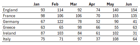
Yet there are times where the information is required, limiting the options to make them more readable
But by using a simple Excel tool, you can add some visual elements to your data table
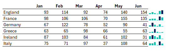
Sparklines
Sparklines are small charts that fit within a single cell that provide a visual representation of data trends. You can also highlight key data points like minimum and maximum
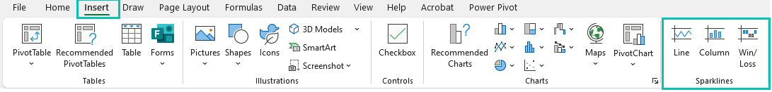
How to use Sparklines
Watch Video
Step by Step Instructions
Sparklines are found on the insert tab, under sparklines. You can either insert columns, line or win / loss mini charts
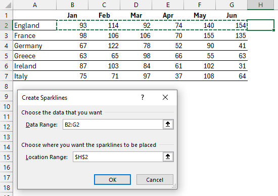
Click on the chart format you want to insert. In this example we will choose columns and the following dialog box pops up:
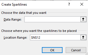
Select the first row of data, in this example it is B2:G2 and we want to put the sparkline in cell H2. Click OK
The sparkline has been inserted
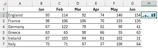
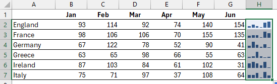
Click and drag the sparkline down to all the rows or copy and past the sparkline
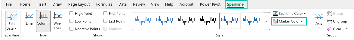
A sparkline tab appears on the ribbon. From there, you can change the column to a line, change the colour of the sparklines and under Marker Colour, you can change colours for the maximum and minimum data point
And there you have it. Sparklines.
Stay ahead with the latest in data visualisation — insights, tools, and trends delivered straight to your inbox.